
Looking for some example MMM outputs charts?
Feel free to download and use these MMM charts.
This example set includes
- Raw example time series
- STL trend and seasonality extraction
- Autocorrelation test (fail, systematic autocorrelation)
- Autocorrelation test (pass, systematic autocorrelation removed)
- Time series anomaly detection
- Media spend by channel by week with sales
- Media spend distribution around media by channel
- Media spend distribution histograms by channel
- Adstock and diminishing returns (example extracted parameters)
- Diminishing returns curves
- Adstock BVOD example @ 60% carryover
- MMM Actual vs Fitted example chart
- MMM Sales Decomposition Chart showing actual vs fitted and the contribution from driver variables
- MMM Waterfall chart: Contribution to Unit Sales by driver
Chart 1: The time series sample itself, unit sales over a three year period from late 2022 to early 2026
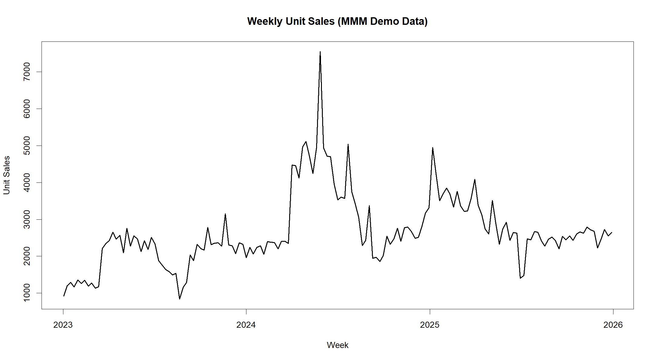
MMM Example time series (Unit Sales) data
Chart 2: STL example extracting the Trend and Seasonality components of the series in order to identify the “Remainder” – the sales that are not explained by Trend and Seasonality
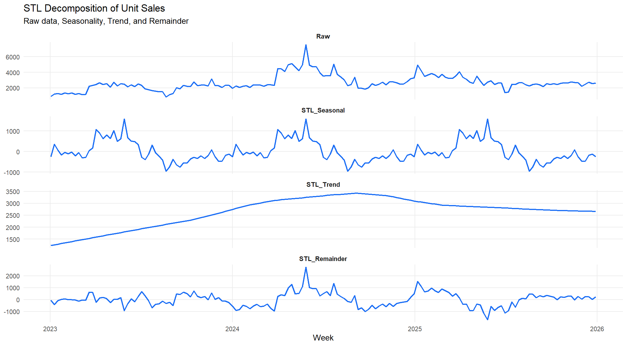
Example of Raw data, Seasonal and Trend components showing Remainder for MMM
Chart 3 Autocorrelation: Within the series we need to check for autocorrelation. This is the degree to which sales this week are correlated with sales from last week. Autocorrelation is like tidal current that sits below the surface of the data. Like currents, autocorrelation represent powerful underlying movements in the data, and they must be acknowledged and understood if you are to build a viable model.
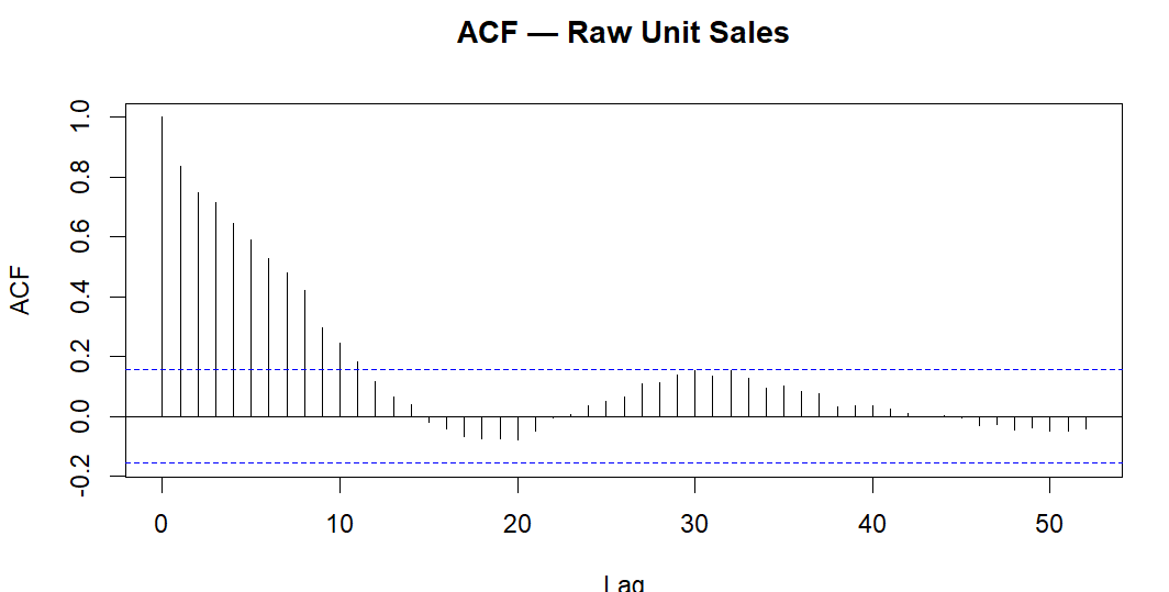
Example of ACF result showing severe systematic autocorrelation at multiple lags for MMM
Chart 4 Autocorrelation Chart 2: In this example we see that the autocorrelation has been controlled.
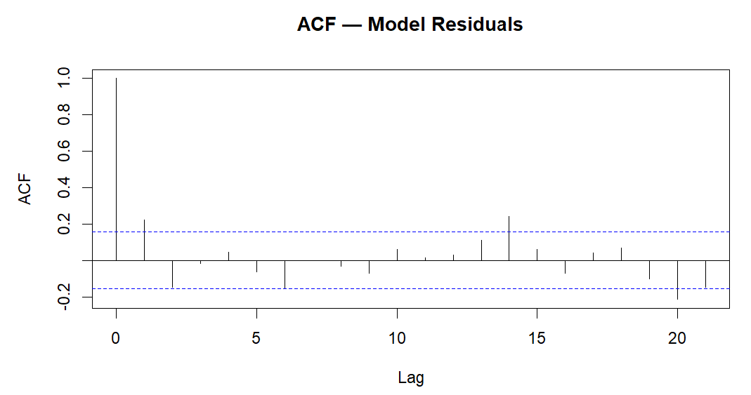
Example of ACF results showing no systematic autocorrelation at multiple lags for MMM
Chart 5 Anomaly Detection Chart: We have to check for unexpected values (anomalies) within the data. Here in this example we look for and identify anomalies in the post-STL remainder series. These are unexpected values that will need to be investigated in the modelling process.
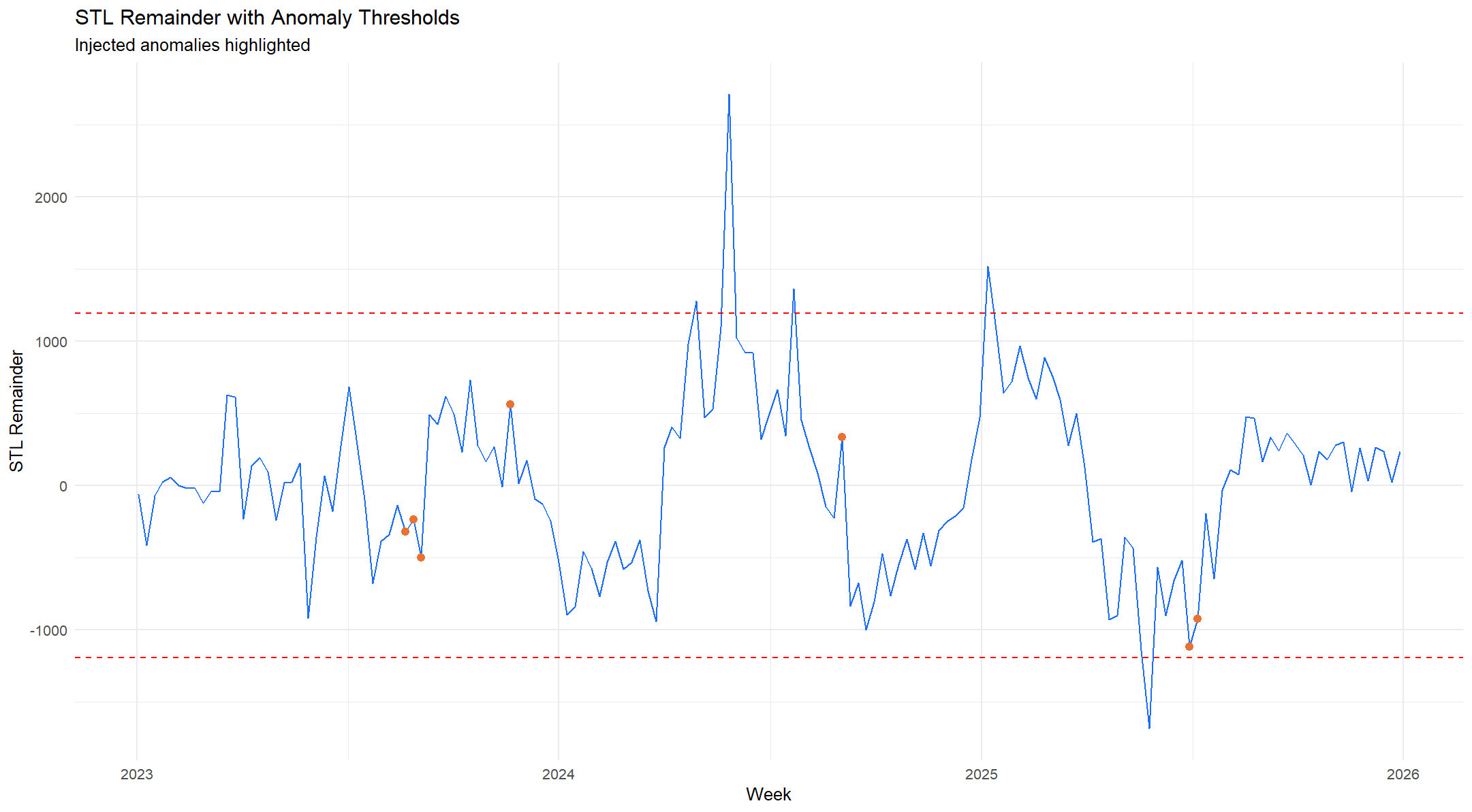
Example of anomalies in a post STL remainder times for MMM
Chart 6 Media Spend Chart: Spend by Channel by Week example chart with sales units
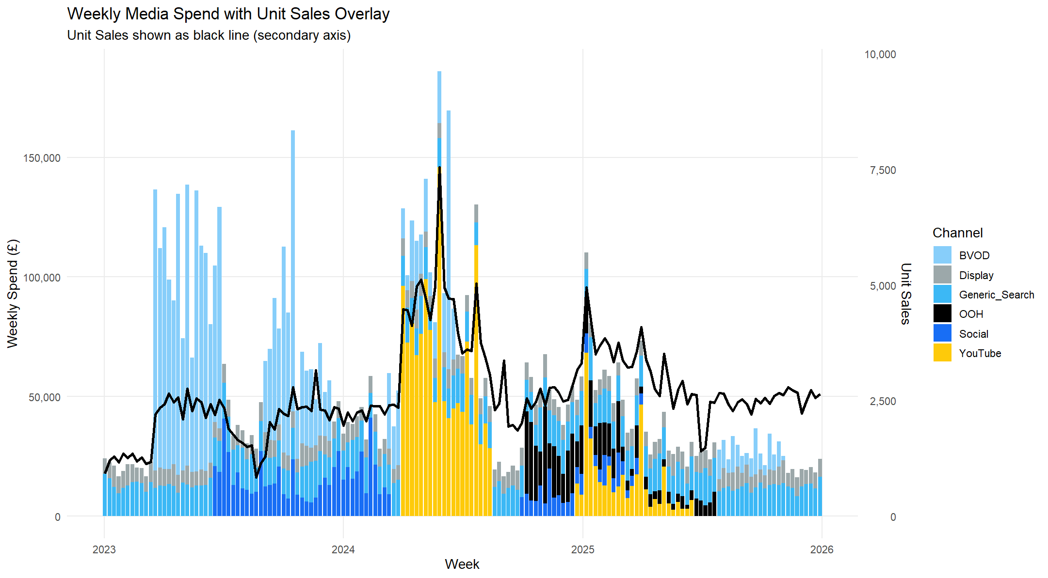
MMM example: Media spend by channel by week with sales
Chart 7 Media Data Distribution Chart: Here we show the distribution of media spend by channel by week (observation).
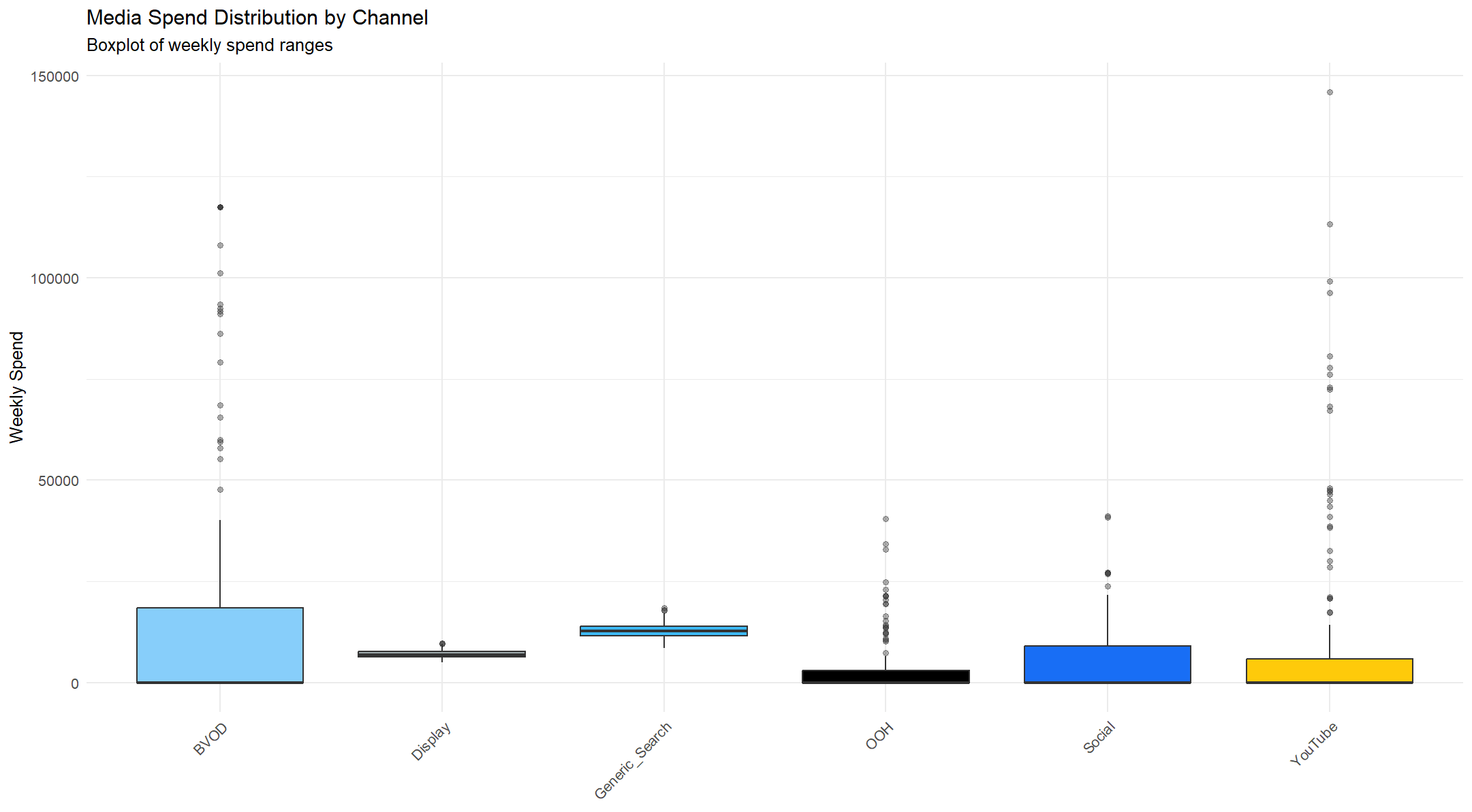
Example of media spend distribution by week observation for MMM
Chart 8 Media Spend Histogram Chart: Distribution of media spend by channel by week. This view allows us to the general weight of investment in active weeks, but also identify weeks in channels with very high or very low spends,
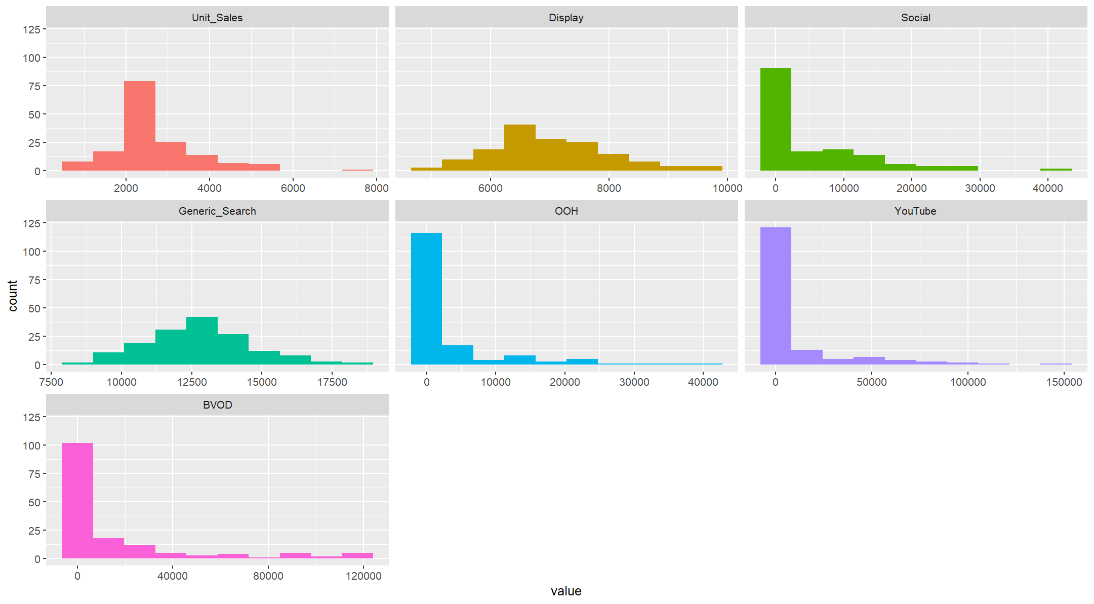
Example of media spend distribution histogram for MMM
Chart 9 Adstock and Diminishing Returns in MMM: Here we see examples of Adstock and Diminishing Returns (non-linear effects)
Adstock is the degree to which media effects in one week “carry over” to the following week. Sometimes called the memory effect (See Ebbinghaus for much more detail on this). Diminishing Returns illustrate the degree to which sales response to advertising media spend declines as spends increase. So if you spend £1,000 and get 1,000 sales, and if you spend £1m you get 1m sales. Of course this never happens and as spend increases sales per unit of spend decrease. 1 = a linear relationship, any value <1 is a non-linear relationsip.
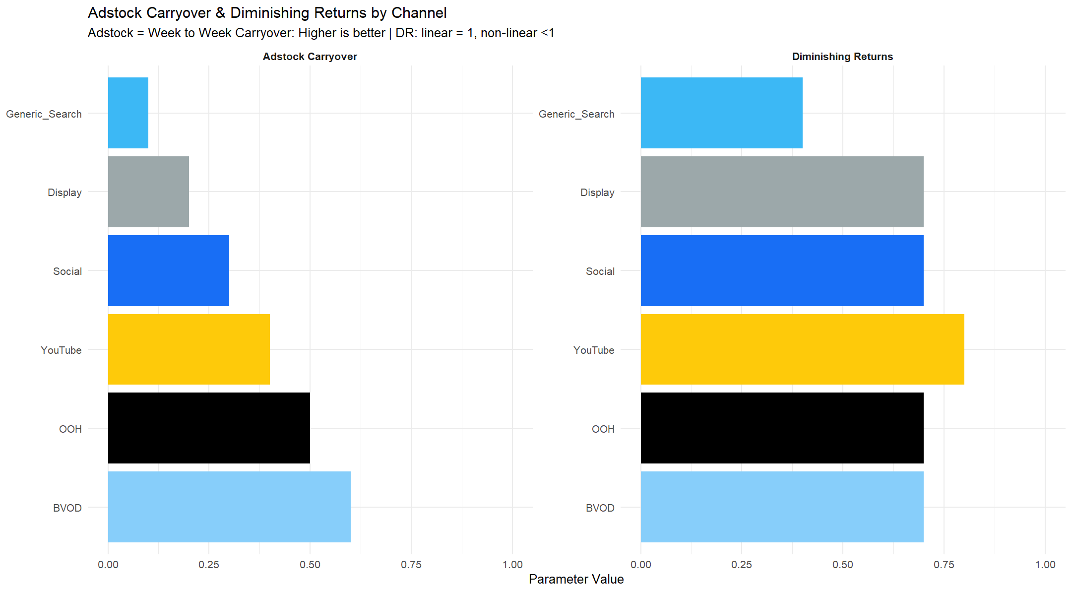
Example of Adstock and Diminishing Returns for Search, Display, Social, YouTube, OOH and BVOD for MMM
Chart 10 Diminishing Returns Chart example: Below is a set of diminishing returns curves for BVOD, Display, Generic Search, OOH, Social and YouTube.
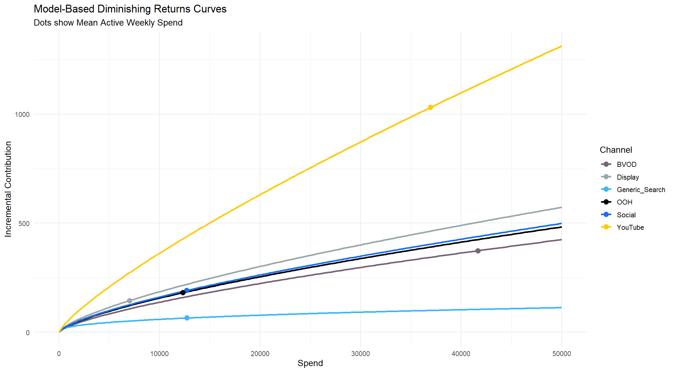
Example of MMM Diminishing Returns Curves by Media Channel
Chart 11 BVOD Adstock Chart example: In this example we see how the raw media spend is transformed when 60% of the value in week 1 is carried over into week 2 and so on.
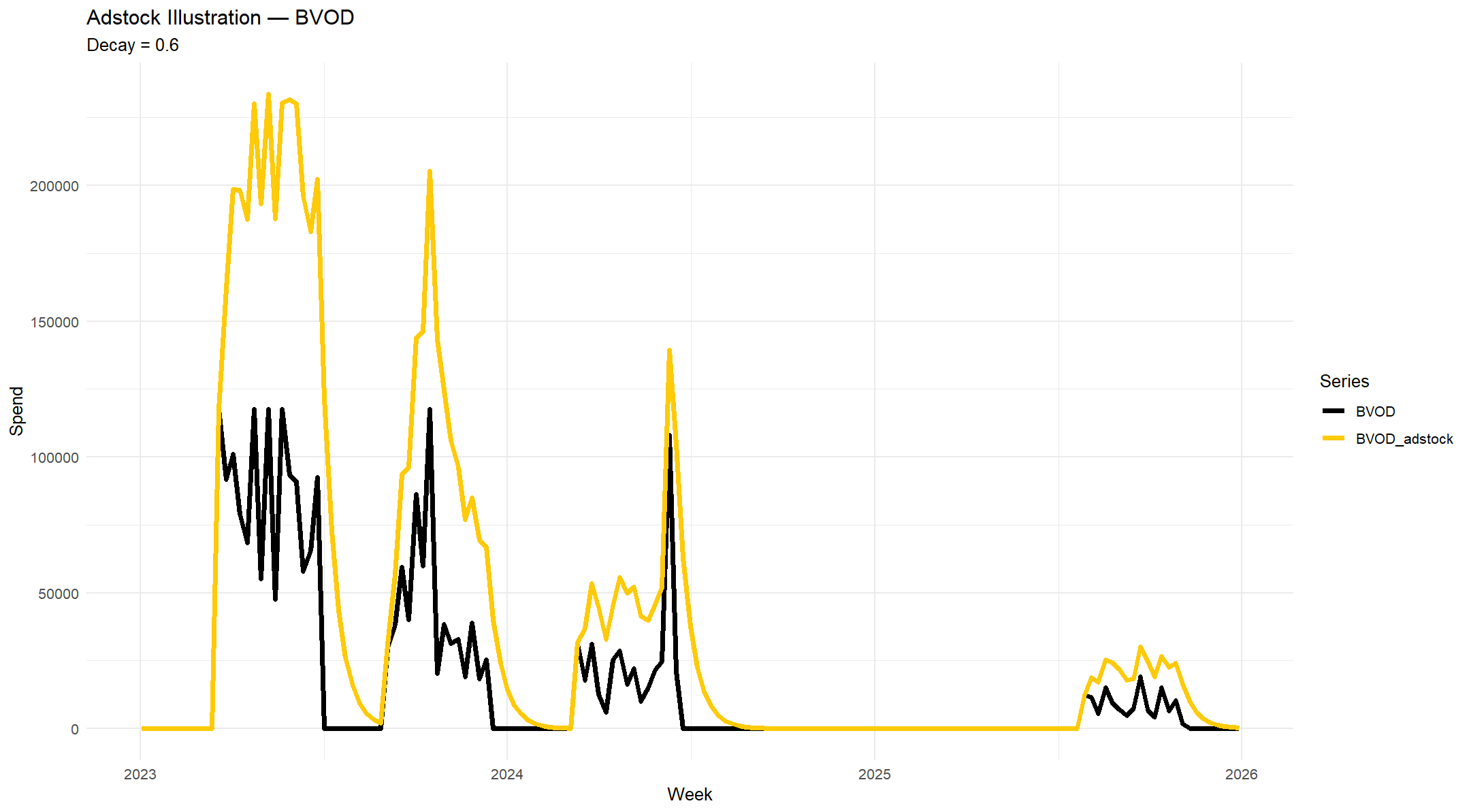
Example of BVOD Adstock transformation at 60% carryover for MMM
Chart 12 Actual vs Fitted Chart example showing how well the models predicts the actual sales in each week of the sample
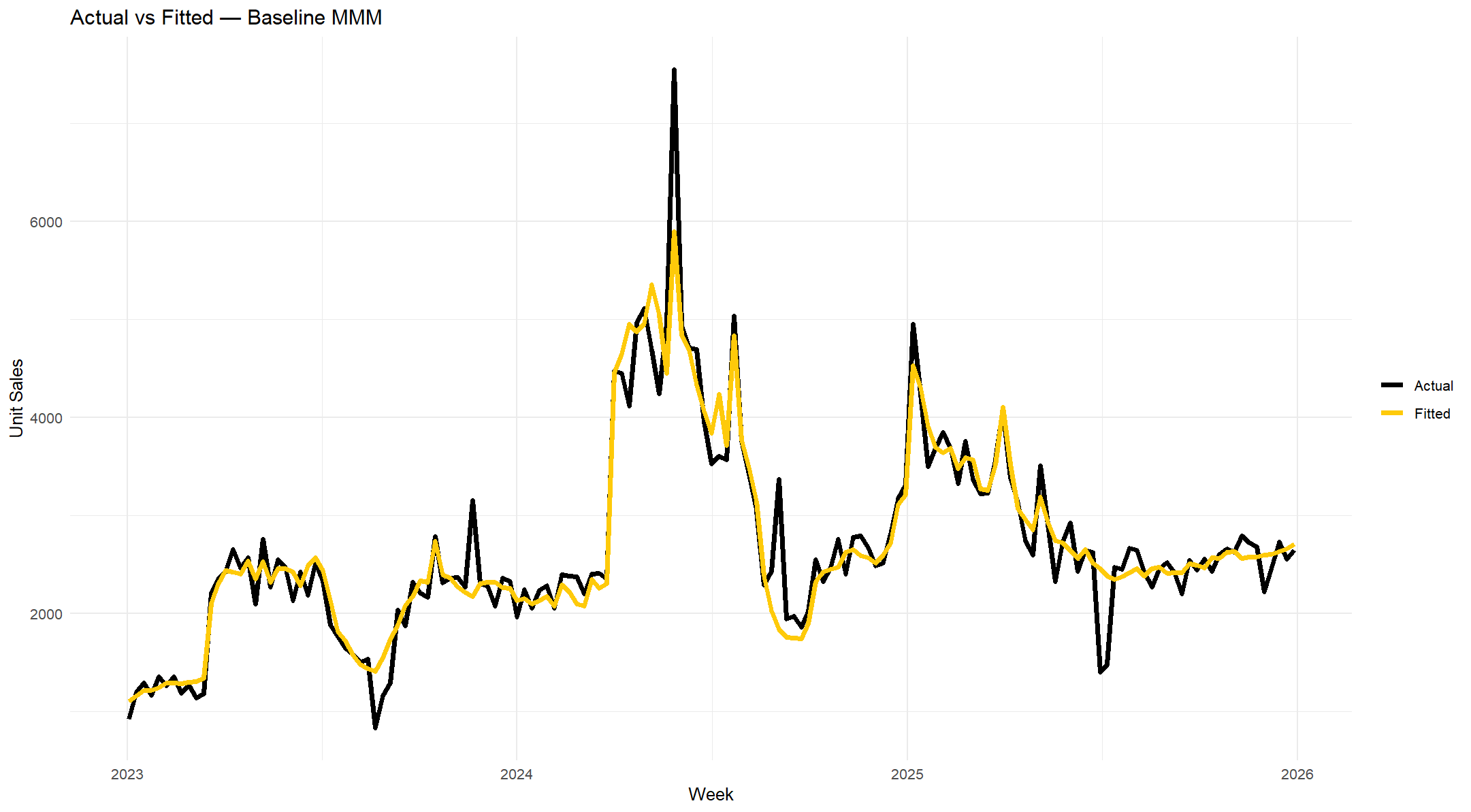
MMM Example Actual vs Fitted showing original unit sales data and model prediction for each week
Chart 13 MMM Decomposition Chart showing media channel contributions only + Base, Trend and Seasonality
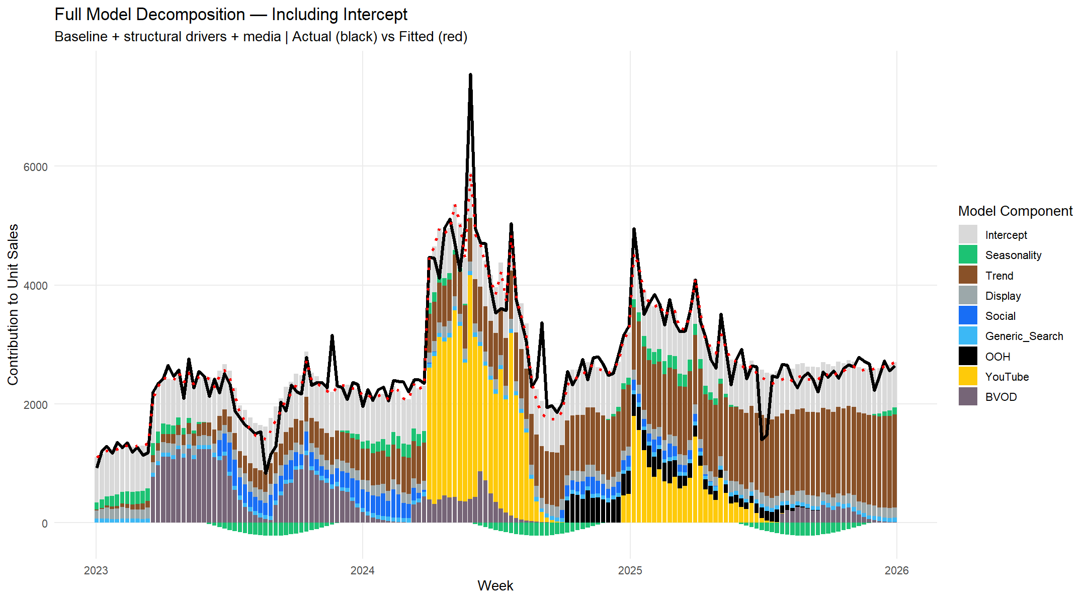
MMM Example Full Model Decomposition including Actual vs Fitted and Trend, Seasonality and Base
Chart 14: Waterfall Sales Unit Contributions including Trend, Seasonality and Base
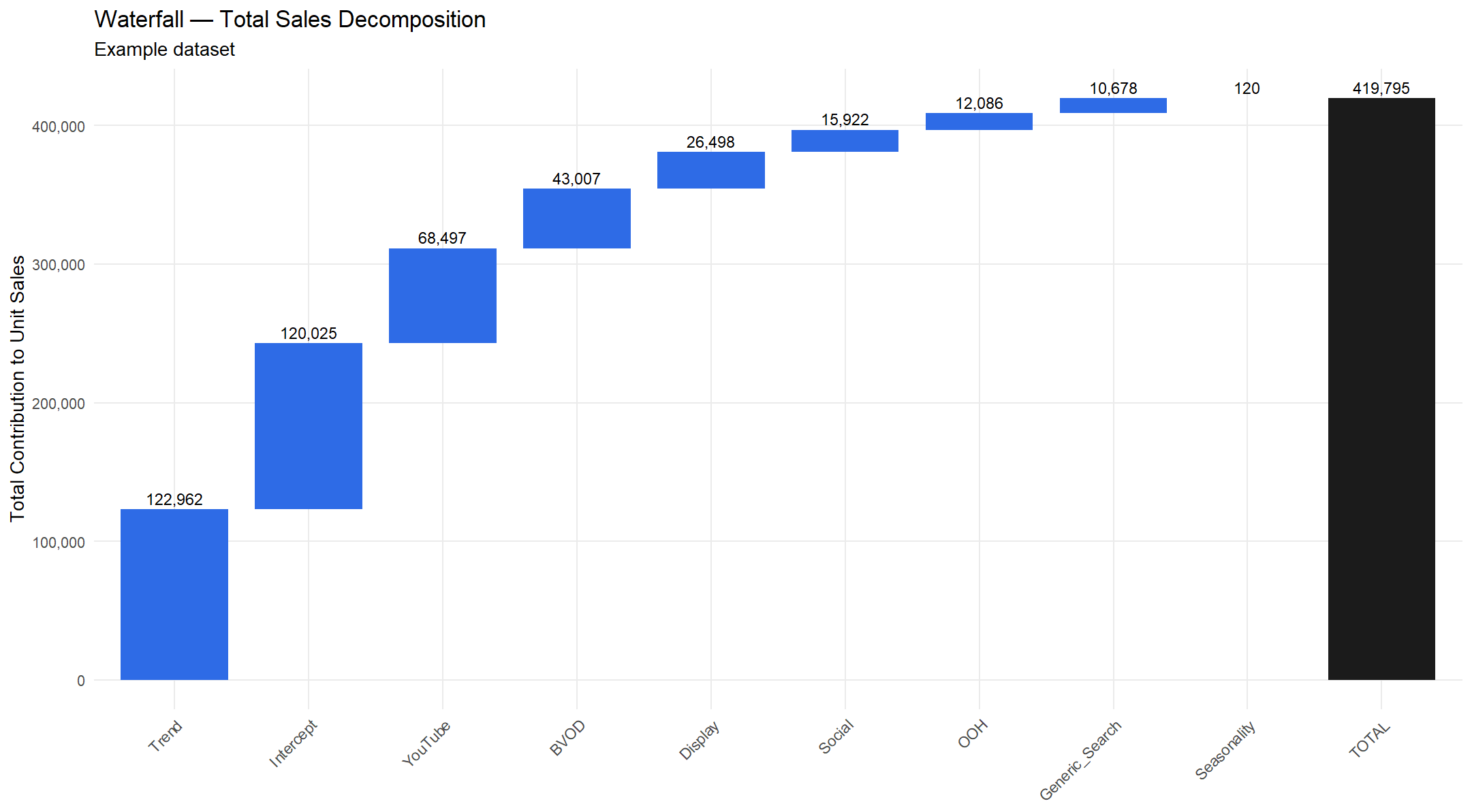
MMM Example Full Model Results (Sales Unit Contributions) Trend, Seasonality and Base